
If you want to be a front-end designer, you need to understand the basic concepts of CSS, like the Box model, Positions, overflow, etc. In this tutorial, I will be explaining the CSS Box Model and its usage in today’s web development.
What is Box Model?
No matter how simple or complex your website layout is, it is created on a core concept that every HTML element on a web page is: a rectangle box. A rectangle box usually has width, height, padding, or margin as well.
The size of the box is determined by the content of the element, its display property, or by specifying its width, height, padding, or margin properties. By default, a box size depends on the size of the content it needs to hold.
What is the Display Property?
The display property determines exactly how an element is supposed to be displayed on the layout. To define an element’s display property through CSS, select that element and declare a new display property value. Display property values are block, inline, inline-block, and none.
Block-level elements take advantage of all available space and stretch as wide as possible, regardless of the size of their content. These would always start from a new line.
Inline-level elements exhibit a humble behavior slightly and take only the space their content requires. These will stick to the same line and mostly used to contain a smaller piece of content, such as a few words, or menu items.
Example of the Display Property
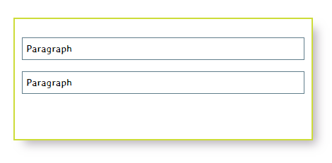
The following example will illustrate the default behavior of block-level elements.
Define two p(Cyan border) elements inside a div(Lemon-Green border). The width of div is set to 300px. By default, div and p elements areblock-level. So they would take as much as space available to these.
  <div>
    <p>1st paragraph</p>
    <p>2nd paragraph</p>
  </div>
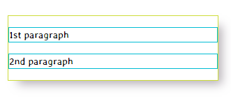
block-level Example
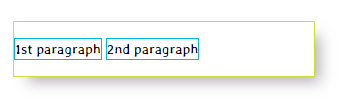
Now if you change the display property of the p element to inline, the elements would stay in line.
p {display : inline;}
inline Example
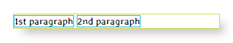
Now change the display property of p element toinline-block, the elements would still stay in line, but now there is some white space being added.
p {display : inline-block;}
inline-block Example
Lastly, the display property set to none. The web page will be rendered as the p element doesn’t even exist.
p {display : none;}

none Example
It is relatively essential that you understand how to display property works and how you can change it. You can’t animate this property though. Changing display from inline-block to inline or block through a transition, technically, doesn’t make any sense.
Working with the Box dimensions
Width and height are the core parts of the box model and can be set using the CSS property 'width' and 'height'.
Let’s look at another example:
div
{
border:10px solid #CDDC39;
width:400px;
height:150px;
}
p
{
border:1px solid #00BCD4;
padding:10px;
margin:10px;
}
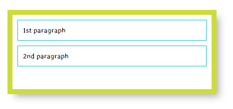
Width & Height Example
According to the box-model the width of the element will be calculated as:
Width = margin-right + border-right + padding-right + width set + padding-left + border-left + margin-left
Width of the container element will be:
= 0 + 10 + 0 + 400 + 0 + 10 + 0
= 420px
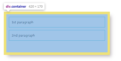
Container Width
As the width property of the p element isn’t defined, so being a block-level element it will take as much space available.
10 + 1 + 10 + width of p element + 10 + 1 + 10 = 400px
42+ width of p element = 400px
Width of p element = 400 – 42 = 358px
To calculate height use the following formula:
Height = margin-top + border-top + padding-top + height set + padding-bottom + border-bottom + margin-bottom
Height of the container element will be:
= 0 + 10 + 150 + 0 + 10 + 0
= 170px
Height of both p elements are determined by the adding margin-top + border-top + padding-top + height of the content it contains + padding-bottom + border-bottom + margin-bottom.
= 10 + 1 + 10 + 20 + 10 + 1 + 10
= 62px
As the p element has only one line of text with line-height set to 20px (default for many browsers), the height of the content is 20px.
Height of 2 p elements will be 62+62 = 124px. As the total height of the container is 170px. If you try to add another p element in the container, it will demonstrate a behavior known as overflow.
  <div class="container">
    <p>1st paragraph</p>
    <p>2nd paragraph</p>
    <p>3rd paragraph</p>
    <p>4th paragraph</p>
  </div>
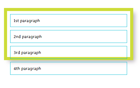
Overflow Example
A CSS hack for overflow is to introduce a CSS rule that hides the overflow.
.container {overflow: hidden;}
This code will hide the element flowing outside the container.
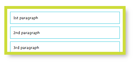
Hide Overflow Example
I admit Box model is one of the most complicated CSS concepts but hang on; we have more to learn.
Width and Height
Every element on a web page has default width and height. The default value of these depends on its display value. Block-level elements have 100% width, taking up all the space available. Inline and Inline-block level elements expand and contract according to their content. The inline-level element doesn’t have a fixed size. To set the width of a non-inline element, use the width property.
.container { width:300px;}
To set height, use the height property.
.container { width:300px; height:150px;}
Limiting the width and height of the box
Some web pages exhibit responsive behavior to fit in the user’s device screen. In such designs, you can limit the width of the box using min-width and max-width properties. Width of the box won’t shrink any further than what is set in min-width and won’t expand any further than max-width. Similarly, you can set the limit for max and min height using the max-height and min-height properties.
.container {max-width: 600px; min-width:300px; }
Border
Every box has a border, even if it is invisible or its width is set to zero. The border has few CSS properties that are commonly used in web development, like border-width, border-style, border-color, etc.
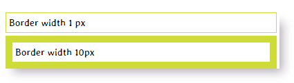
Border width
The border-width property defines the width of a border. You can’t use percentage unit to set this property.
It can be further separated as border-top-width, border-right-width, border-bottom-width, border-left-width. You can also define the widths of four borders in one CSS rules as:
border-width: top right bottom left;
p.one{border-width:1px;}
p.two{border-width:10px;}
<div class="container">
<p class="one">Border width 1 px</p>
<p class="two"> Border width 10px</p>
</div>
Border width Example
Border-Style
border-style property can take solid, dotted, dashed, double, groove, ridge, inset, outset, hidden/none as the value.
.container{ width:400px; }
p{ padding:4px; margin:4px; border-color:#CDDC39; }
p.one {border-style: solid;}
p.two {border-style: dotted;}
p.three {border-style: dashed;}
p.four {border-style: double;}
p.five {border-style: groove;}
p.six {border-style: ridge;}
p.seven {border-style: inset;}
p.eight {border-style: outset;}
<div class="container">
<p class="one"> Solid Border Style</p>
<p class="two"> Dotted Border Style</p>
<p class="three"> Dashed Border Style</p>
<p class="four"> Double Border Style</p>
<p class="five"> Groove Border Style</p>
<p class="six"> Ridge Border Style</p>
<p class="seven"> Inset Border Style</p>
<p class="eight"> Outset Border Style</p>
</div>
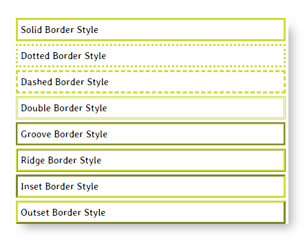
Border-Style Example
Border-color
You can also define the color of the border using either RGB values, RGBA values, hex codes, or CSS color names. RGB and hex values are the same, but with RGBA, you can add an alpha variable to define the opacity of the border. You can achieve the semi-transparent border effect with RGBA value.
.container{ width:400px; padding:5px;}
p{ padding:4px; margin:4px; border:1px solid #CDDC39; }
p.one{border:2px solid; border-color:#E91E63;}
p.two{border:2px solid; border-color:cyan;}
p.three{border:2px solid; border-color:RGBA(0,0,0,0.1);}
p.four{border:2px solid; border-color:RGB(0,0,0);}
<div class="container">
<p class="one">Pink Border</p>
<p class="two"> Cyan Border</p>
<p class="three">Grey Border</p>
<p class="four">Black Border</p>
</div>
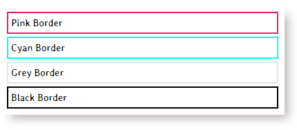
Border-color Example
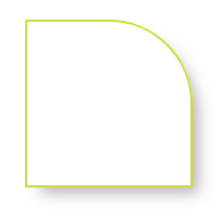
Border Radius
The border-radius property let us define the radius of the corners of an element. It accepts pixels and percentage as a length unit. The border-radius property will take top-right, bottom-left, bottom-right, and top-left values.
<div class="container"> </div>
.container{ width:150px; height:150px; border:2px solid #CDDC39;
border-radius: 15px;
}
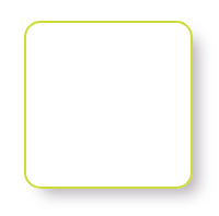
Border Radius Example I
With border-radius property set to 50%
.container {border-radius: 50%;}
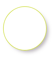
Border Radius Example II
With shorthand version, a single value will round all four sides of the element’s border. Two values will work on top-left/bottom-right and top-right/bottom-left fashion.
This will set border-radius on all four sides using shorthand.
.container {width:150px; height:150px; border:2px solid #CDDC39; border-radius: 50% 0; }
Border Radius Example III
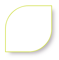
If you want to change only one corner of an element.
.container{ width:150px; height:150px; border:2px solid #CDDC39; border-top-right-radius: 50%; }
Border Radius Example IV
Padding
The padding property allows you to specify the space between the content of an element and its border.
p{border-color:#CDDC39; }
p.one{border:1px solid; border-color:RGB(0,0,0);}
No Padding Example
p{border-color:#CDDC39; padding:10px; }
With Padding Example
The padding property can take padding-top, padding-right, padding-bottom, padding-left value. The value is usually specified in pixels, but you can use other units like ems, rems, or percentage.
Margin
The margin properties allow to you specify the space between boxes. This property can be further broken down into margin-top, margin-right, margin-bottom, margin-left.
You can also use the shorthand version like margin: top right bottom left; (Clockwise order)
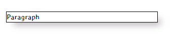
.container{ width:300px; border:2px solid #CDDC39;}
p{padding:5px; border:1px solid #607D8B;}
<div class="container">
<p class="one"> Paragraph</p>
<p class="two"> Paragraph</p>
</div>
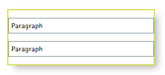
No Margin Example
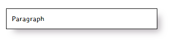
Now, if you add a margin of 10px to the p element. Saying margin:10px is a shorthand way of saying that set-top, right, bottom, and left margin of the element to 10px. As you can see, this is more presentable now.
Inline-level elements behave differently than block and inline-block level elements. Margins will only apply on left and right on inline-level elements. Padding works in all four directions, but the top and bottom padding may bleed on the top and bottom side.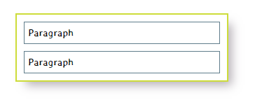
With Margin Example
Box Sizing
As you have seen above, the box model is an additive in nature. If you define 200px as width, 4px border around the element, the total width would be 4+200+4 = 208. It caused so much pain for the designers for years until CSS3 introduced box-sizing property. With this property, you can change how to box model calculate the element’s size. The property accepts two key values: content-box, and border-box.
IE8 and up supports the box-sizing property, Firefox version less than 29 would require you to use the –moz prefix and anything less than iOS4 and Android 2.3 needs the –webkit prefix. As of the time of writing, I would say, it is pretty much safe to box-sizing as all current browsers support this property.
Content Box
The content-box property value is the default value if you don’t define box-sizing property explicitly. The size of an element would be calculated by adding padding, border, margin, and width and height properties. The model would behave pretty much additive, as explained at the beginning of this tutorial.
div {
-webkit-box-sizing: content-box;
-moz-box-sizing: content-box;
box-sizing: content-box;
}
.container{ padding:10px; width:400px; height:150px; border:2px solid #CDDC39; }
p{ padding:5px; border:1px solid #607D8B; width:100%; }
<div class="container">
<p class="one"> Paragraph</p>
<p class="two"> Paragraph</p>
</div>
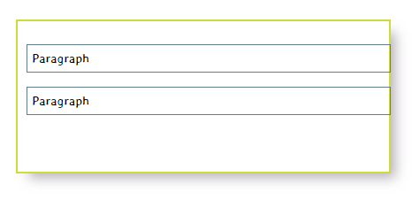
With Padding Example
The width of the p element is set to 100%, that means it will take all available space horizontally. The padding and border will add up to the total width that caused p elements to flow outside the container element.
Content box width = 100% of the parent div (400px)
Content box height = 20px (line-height)
Total width = 400 + (2*5px) + (2*1px) /*5px padding , 1px border*/
= 400 + 10 + 2
= 412px
Total height = (2*5)+(2*1)+ 20 = 32px
As all browsers have support for box-sizing you can leave the prefixes behind.
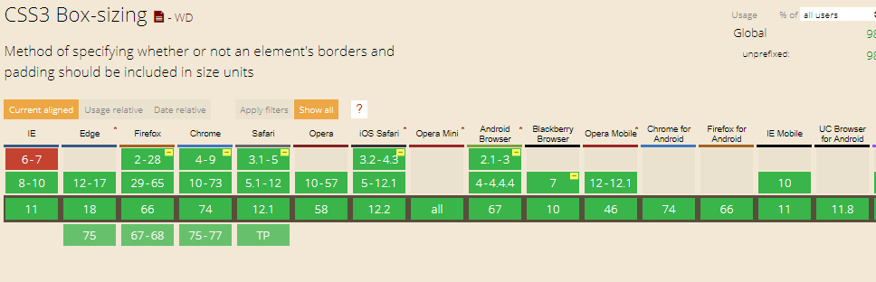
Credit: caniuse.com
Border-box
Theborder-box value changes the box model in a way that border, padding is included within the width and height of an element. Let’s say you declare a div of 400px, 1px border, and 10px padding on every side of the element, the total width will remain 400px. It makes the life of web designers really easy.
p{ padding:5px; border:1px solid #607D8B; width:100%; box-sizing:border-box; }
If you are wondering why we haven’t included a margin in p element like the above examples, we excluded margin because it is not a part of box mode.
Total width = 400px (100% of the parent container)
Content box width = 400px – (2*5px) – (2*1px)
= 400px – 10 – 2 = 388px
box-sizing:border-box to universal selector (*) to keep all the element’s box model at the same level.*, *:before, *:after {
margin: 0;
padding: 0;
-webkit-box-sizing: border-box !important;
-moz-box-sizing: border-box !important;
-ms-box-sizing: border-box !important;
box-sizing: border-box !important;
}
Now, as we have understood the basic concepts of the box model, let’s do a real-world example that uses the box model and properties like border-radius, border-color (semi-transparent), padding, margin, and box-sizing, etc.
<div class="container">
<p>Always code as if the guy who ends up maintaining your code will be a violent psychopath who knows where you live.</p>
</div>
.container{
-webkit-box-shadow: 10px 10px 13px -5px rgba(184,178,184,1);
-moz-box-shadow: 10px 10px 13px -5px rgba(184,178,184,1);
box-shadow: 10px 10px 13px -5px rgba(184,178,184,1);
}
body{font-family:stylish; }
.container{ width:340px; height: 340px; padding:10px; border:1px solid #CDDC39;
background-image:url(https://cdn.pixabay.com/photo/2018/08/14/13/23/ocean-3605547__340.jpg);

}
p{margin:15%; padding:12%; width:240px; height:240px;
box-sizing:border-box;
border:10px solid rgba(255,255,255, 0.6);
border-radius:50%;
background-color:rgba(255,255,255,0.4);
}
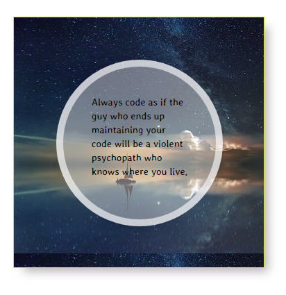
Border-box Example
I have tried my best to explain the box model, but if you have any questions or confusion related to the box model or any other properties mentioned in this article, please feel free to ask in the comment box below.